Thinking about what design to tuft? This is the guide we wish we could send every guest before they arrive. What works, what doesn't, and how to get the best result from your first session.
How to Design a Rug for Tufting: What Works and What Doesn't
The single question we get more than any other — before bookings, in emails, in the studio on the day — is some version of this:
"I have an idea. Will it work?"
After thousands of sessions at Cheeky Studio, we have a pretty clear answer to that. This guide is the honest version of what we tell guests when they ask.
The golden rule of tufting design
Before anything else, here it is: simple always wins.
Not because tufting can't handle complexity — it can, up to a point. But because the constraint of the medium is real, and working with it produces better results than fighting against it. The rugs that come out looking most impressive are usually the ones that commit to a bold, clear idea rather than trying to replicate a detailed photograph.
Think of it like screen printing. You wouldn't try to reproduce a watercolour painting through a screen. You'd use the constraints of the process to your advantage — solid colours, defined shapes, graphic contrast.
Tufting works the same way.
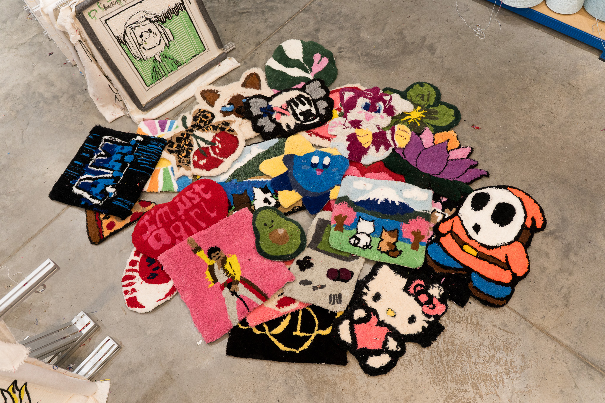
What makes a good tufting design?
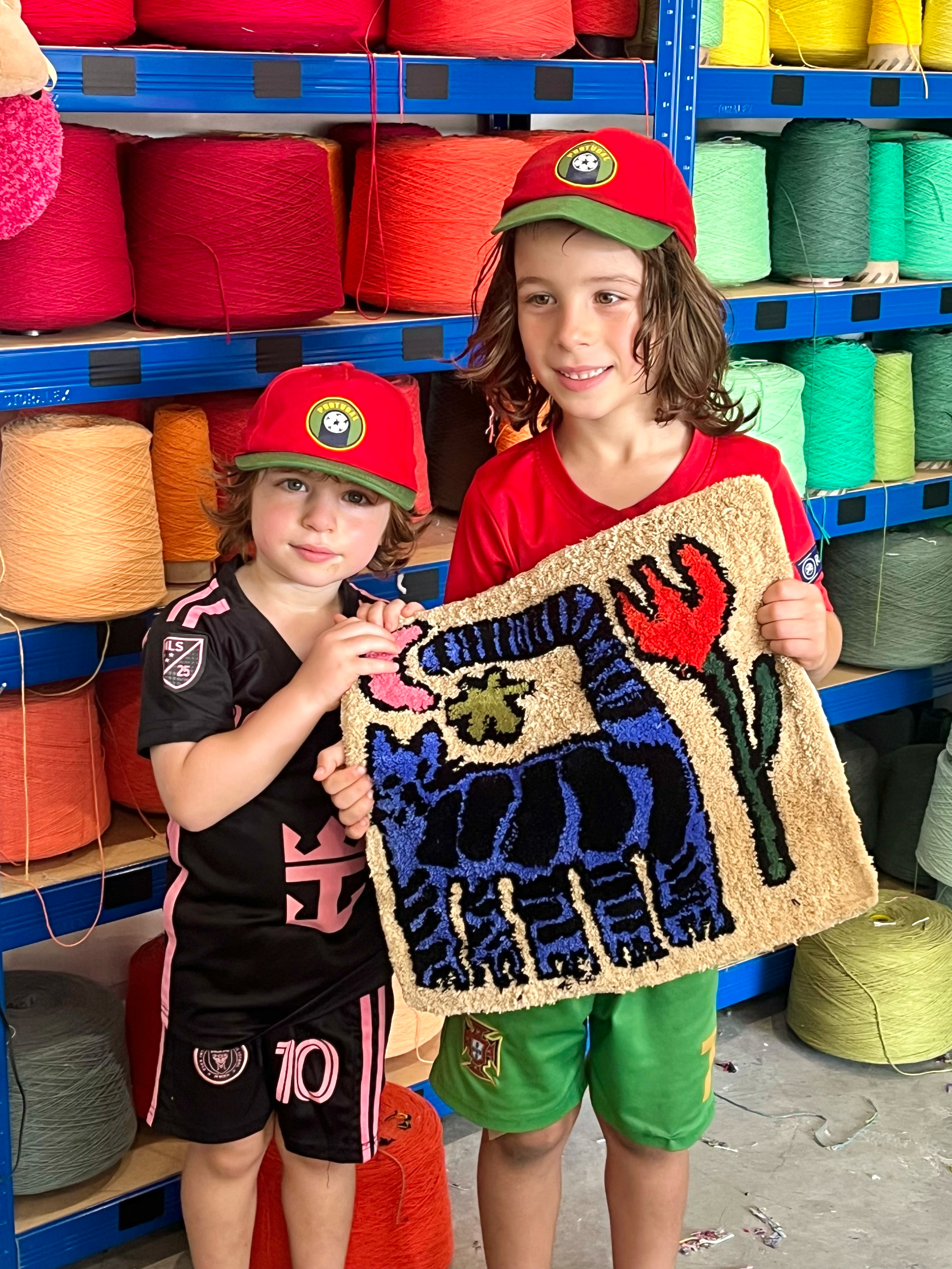
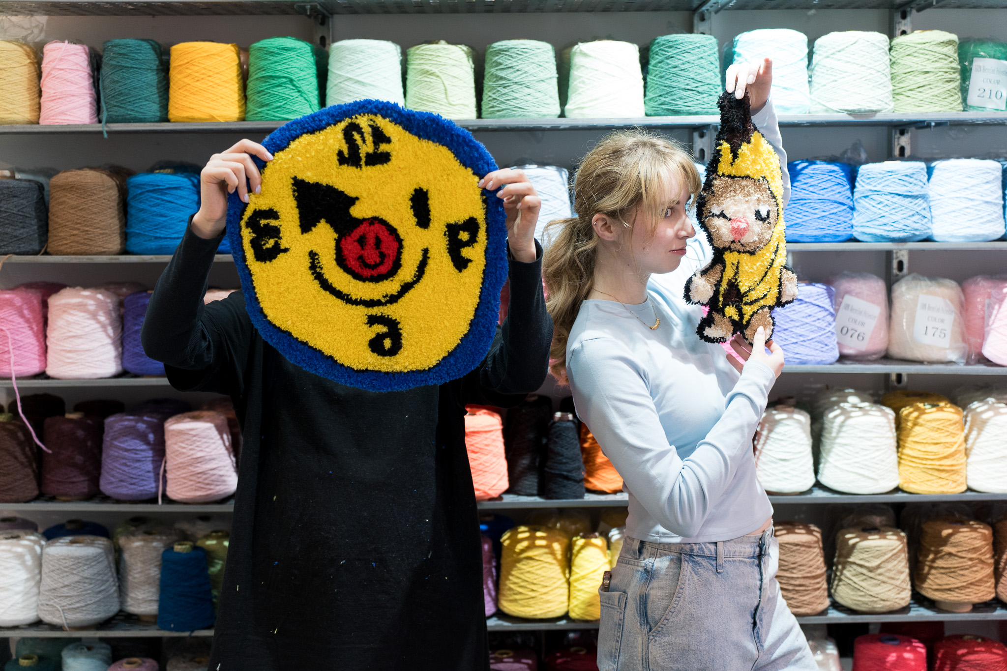
Strong outlines and clear shapes
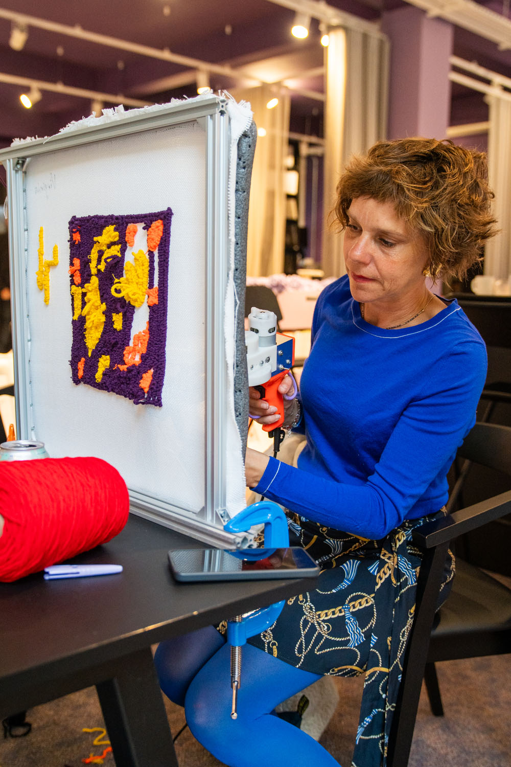
Tufting is essentially drawing with yarn. The tufting gun moves along your design lines, filling in areas of colour row by row. This works beautifully when your design has clear, defined shapes — and less well when the boundaries between colours are blurry or highly detailed.
Think logos, letters, animals with simple silhouettes, bold florals, geometric patterns, abstract shapes. Think less about photographic realism and more about how something would look as a graphic illustration.

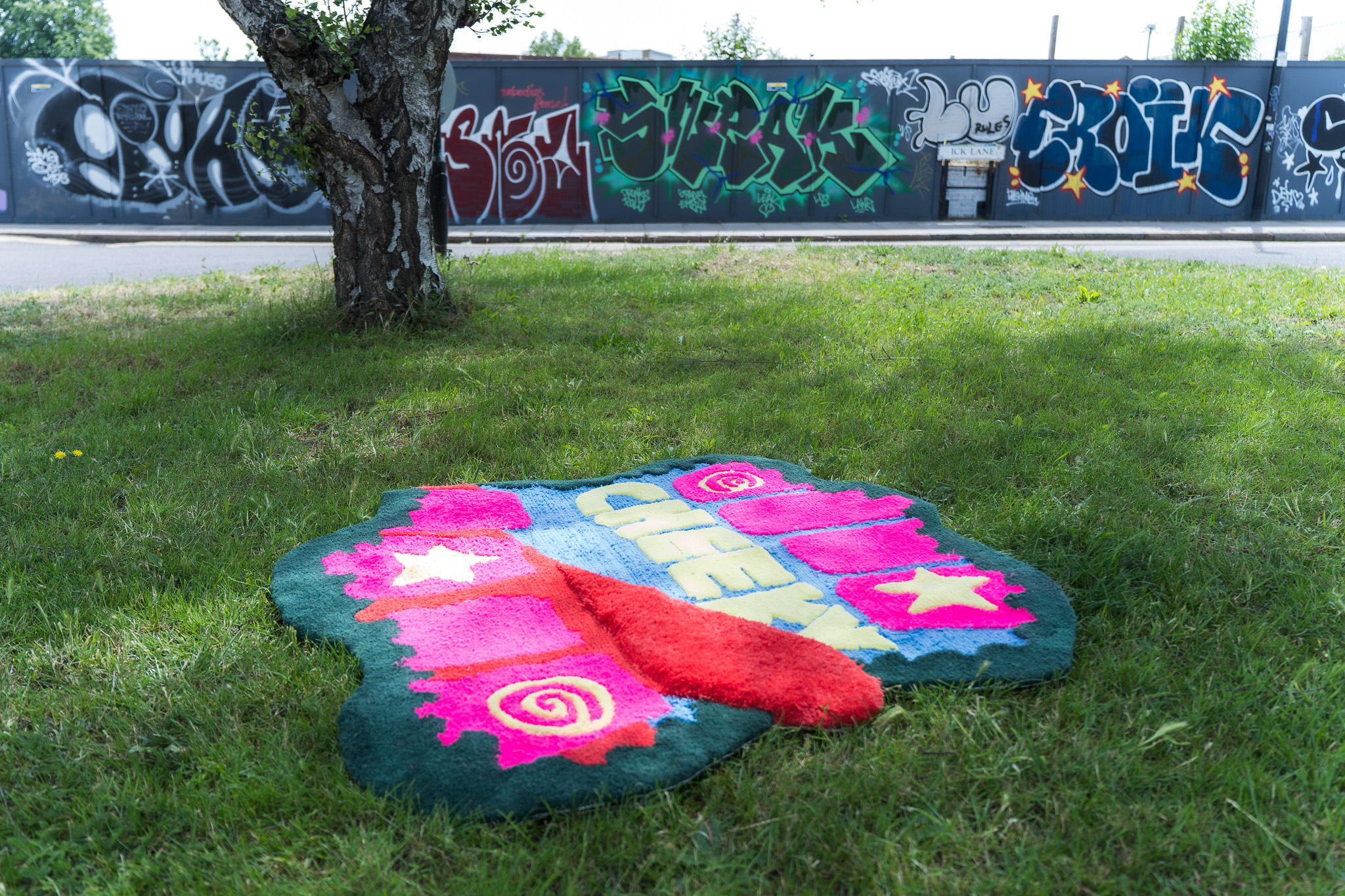
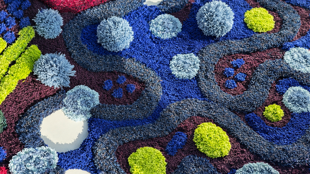
Bold colour blocking
Designs with large blocks of colour tuft faster, look cleaner, and have more visual impact on a wall. If your design has five distinct colour zones, that's good. If it has fifteen gradients, you'll spend half the session on colour transitions that won't read clearly in the finished piece.
A useful test: squint at your design reference. If the main shapes are still obvious when blurred, it'll translate well to tufting.
Designs that scale well
For a Standard Rug (40×40cm), your design is working within a relatively compact canvas. Details that look fine at full screen will become indistinct at rug scale. The more your design relies on fine detail, the more it'll need to be simplified for tufting.
Grand Rugs (55×55cm) give you more room — but the principle is the same. Scale your ambitions to match your canvas.
What doesn't work well in tufting?
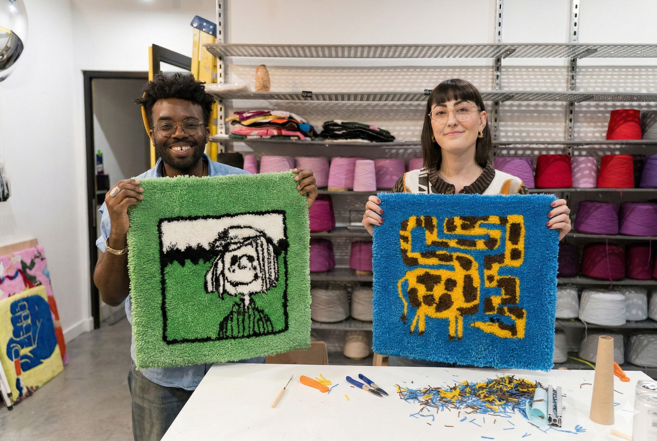
Photographs of faces
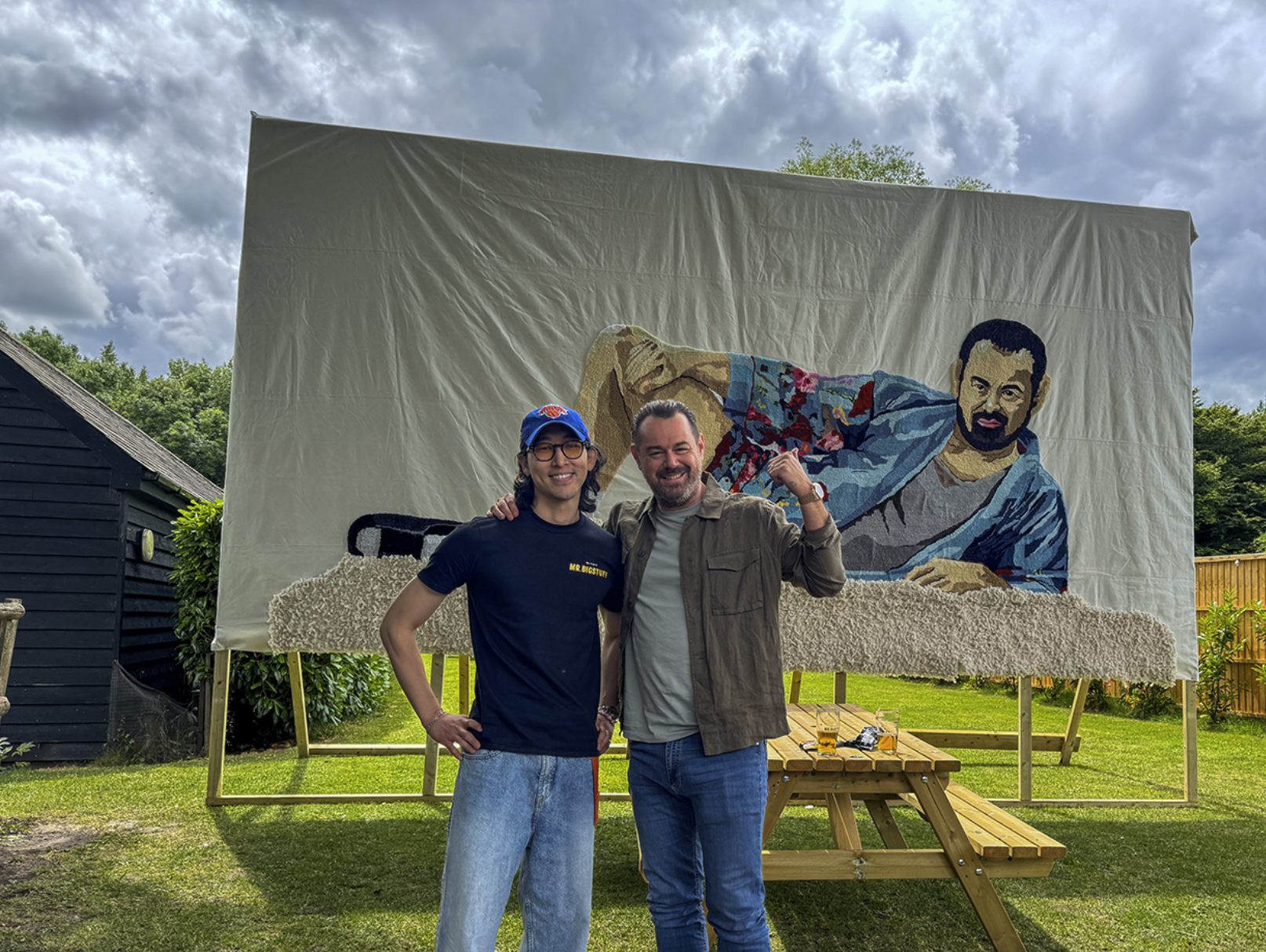
This is the most common mismatch between expectation and result. A photograph of someone's face has hundreds of subtle colour variations, shadows, and micro-details. Tufting, by its nature, works in discrete colour zones rather than continuous gradations. You can absolutely tuft a portrait — but it needs to be stylised first. Think bold illustration, not photorealism.
When clients bring us face references, we always ask: can we convert this into a graphic version? Usually yes. The result tends to be stronger than the original anyway.
Thin lines and intricate detail
Very thin lines — text in a small font, fine linework, delicate patterns — are difficult to execute at tufting scale. The tufting gun occupies physical space as it moves, and very fine elements can become indistinct or merge into surrounding areas.
If your design includes text, bold and chunky letterforms work well. Thin serif fonts do not.
Designs with too many colours
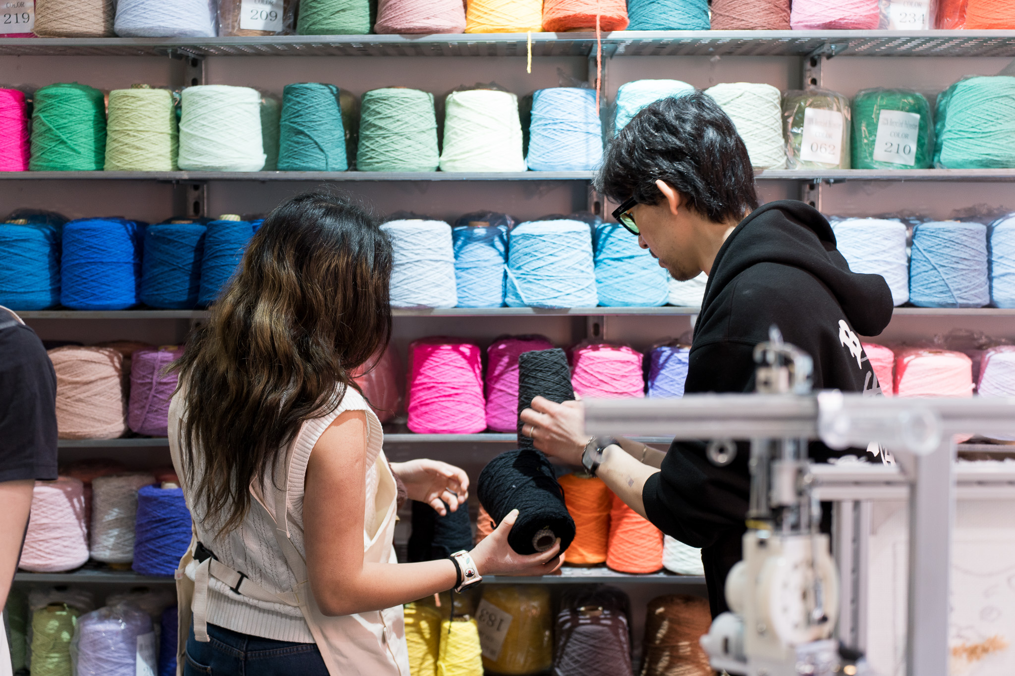
There's no hard limit — our studio has 115 colours of Cheeky Yarn, so we're not short of options. But designs that require ten or more distinct yarn changes in a small area become complex to execute within a single session. Each colour change involves rethreading and careful boundary work. The fewer colour changes, the smoother the session.
Our recommendation: five to seven colours is a sweet spot for most beginner designs.
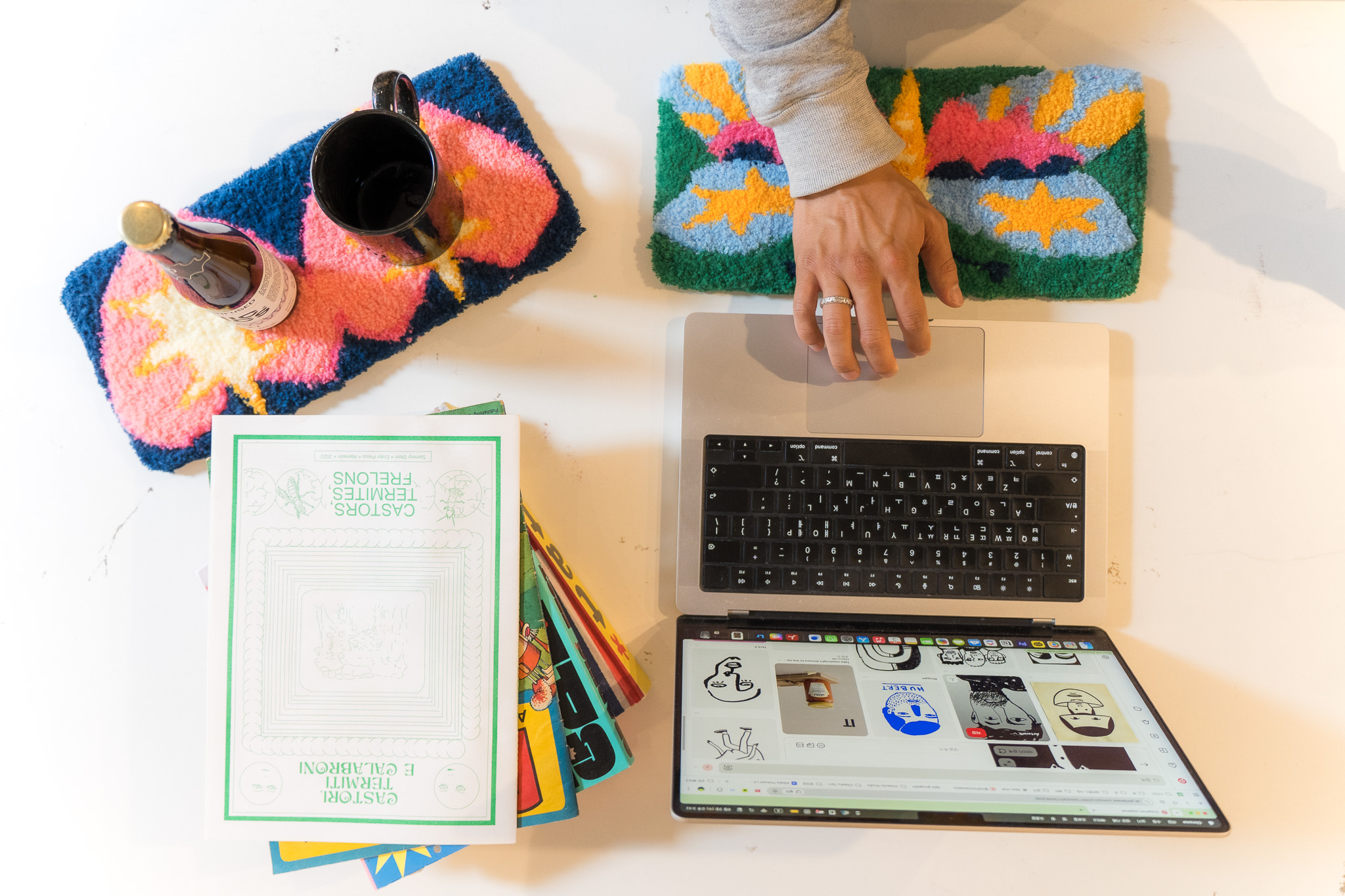
Cut pile or loop pile — does it affect your design?
Yes, and it's worth thinking about before you finalise your design.
Cut pile produces a short, plush, velvety surface. It's smooth, soft to touch, and shows colour clearly. It's ideal for designs where sharp colour boundaries and clean edges matter.
Loop pile leaves the yarn loops intact, creating a more textured, raised surface. It's durable, has a slightly more handmade feel, and works well for designs where texture is part of the visual effect.
Most studios only offer cut pile. At Cheeky Studio, you can use both — and combine them in a single rug. Mixing cut and loop pile in the same piece creates a sculptural, multi-dimensional effect that's one of the more striking things you can do in a single session.
If you're thinking about mixing pile types, discuss it with us when you submit your design — we'll sketch it out accordingly.

How much detail can you realistically achieve?
Here's an honest breakdown by design type:
• Bold geometric / abstract
Easy to tuft and gives very clean results.
✅ Excellent
• Simple animal silhouettes
Works really well with simplified shapes and bold outlines.
✅ Excellent
• Large text / single words
Best with thicker lettering and simple typography.
✅ Excellent
• Bold floral patterns
Great for tufting when shapes stay graphic and simplified.
✅ Very good
• Logos / brand marks
Usually work well with minor adjustments if needed.
✅ Very good
• Landscapes / skylines
Can work nicely depending on detail level and composition.
⚠️ Depends on simplicity
• Stylised portraits / illustrations
Often need some simplification before tufting.
⚠️ Needs simplification
• Photographic portraits
Very difficult to recreate exactly in yarn.
❌ Requires major redesign
• Fine-line botanical details
Tiny details and thin lines may disappear once tufted.
❌ Detail can be lost at scale
How to submit your design to Cheeky Studio
When you book a workshop, we ask you to send your design at least 24 hours before your session. We sketch it directly onto your canvas so it's ready and waiting when you arrive.
Here's what to send:
Not sure if your design will work? Send it anyway. We'll tell you honestly, suggest adjustments if needed, and make sure the canvas version is set up to give you the best result.
We've made it work with a photo of someone's dog, a hand-drawn sketch on a napkin, and a reference image from a 1970s album cover. The brief doesn't need to be polished — just clear enough to work with.
What if I don't have a design?
More common than you'd think, and not a problem. Come to the session with a mood, a colour palette, or a theme — and we'll work something out together. The studio has reference books, printed examples, and several members of a team who are used to turning vague ideas into usable designs on the spot.
The only thing you shouldn't do is show up hoping inspiration will strike while you're standing in front of a blank canvas. That approach works for some people. For most, a starting point — however rough — makes the session go better.
The designs that stick with us
In three years of running workshops at Cheeky Studio, the rugs that stay in our memory are almost never the complicated ones. They're the bold ones. The ones where someone committed to a simple idea, chose colours with confidence, and let the technique do its job.
A single large letter on a solid background. A dog with four colours and no pretension. A wave pattern that took thirty minutes to design and three hours to execute perfectly.
The medium rewards clarity. When you design with that in mind, the result tends to surprise you.
Ready to book your session?
Send us your design idea at contact@cheekystudio.uk or submit it when you book. We'll have your canvas sketched and ready before you arrive.
Standard Rug: 3 hours · 40×40cm · from £145Grand Rug: 5 hours · 55×55cm · from £195
📍 D009 Tradestars, 415 Wick Lane, Hackney Wick, London E3 2JG🕙 Open every day, 10am–5pm